


As the Coronavirus started to spread to other countries late February, and Chinese data came in showing a dramatic slowdown in production and spending, reality quickly sunk in to equity markets.
Analysts showed that we saw the fastest “correction” in history (down 10% from a high), occurring in a matter of days. In the last week of February, the Dow fell 12.36% with notional trading of $3.6 trillion.
Message traffic exploded. Nasdaq’s own systems saw a record of 62 billion messages in one day, well above the average day of 18bn. On Friday, the market traded $989bn, a one day record.
But was last week really that exceptional? Let’s take a look at the data to find out.
Five-day realized volume has been much higher
Although the constant selling on strong volumes made it feel like a volatile week, statistically, the market has realized much higher levels of five-day volatility. Looking back, a few interesting times stand out (Chart 1):
- 1930’s: The Great Depression caused prolonged, extreme volatility. Not surprising given unemployment hit 24.9% and markets lost almost 90% of their value.
- From 1939 – 1945: The Second World War saw a similarly prolonged bout of extreme market volatility.
- 1962: A six-month long “ Flash Crash” (how times have changed) saw a nearly 27% drop in the Dow Jones Industrial Average over around six months. Although no event seems to have caused this, sentiment and stretched valuations are cited as contributing.
- 1987: Black Monday stock market crash on October 19, 1987 saw the largest one-day drop in stock market history, with the Dow Jones falling more than 22%. Debate remains about what actually caused this selloff too, although a combination of new automated selling “programs,” margin calls, economic stagflation and geopolitical events in the Middle East have been cited as contributing.
- 1999-2002: Tech-bubble & burst, through to the after the Sept 11, 2001 attacks was a period of elevated volatility.
- 2008: The Credit Crisis saw realized volatility reach the second highest levels in 80 years, with 18 days where the market moves over 5% as the global market endured a great recession and many banks failed.
- 2011: S&P downgraded U.S. sovereign debt.
- From 2011 to 2013: European markets had an evolving sovereign debt crisis that started in Greece and spread to more of the EU region in 2013.
Each one of these events caused U.S. realized 5-day volatility to spike above levels seen last week.
Chart 1: Realized five-day volatility (annualized) over the past almost 100 years shows many spikes greater than last week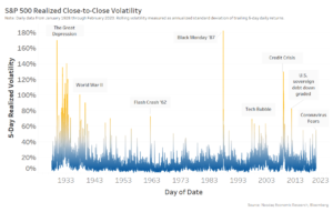
Turnover was higher in the Euro Sovereign Crisis and the Credit Crisis
Although Friday (Feb. 28 2020) saw record notional volume, with $989 billion traded, it represented only the second-most shares traded (19.4 billion shares). The record for shares traded in a day is still held by the Credit Crisis, with 19.8 billion shares on October 10th 2008. That date is almost a month after the Lehman collapse and the AIG bailout, but was when the Fed realized its injections were not large enough to stem losses. The next day, G7 leaders met to co-ordinate a global response.
Because notional trading gets a boost from inflation, it’s difficult to compare the fear last week to the fear back in 2008. As we’ve said before, a better measure of liquidity might be turnover (the percentage of all market cap that traded in a period). By that metric, even the most liquid day last week falls well short of the liquidity trading in both the credit and sovereign crisis events, where on some days over 4% of market cap was traded. However, the high of 4.83% was hit on that same date back on 10 October 2008, right in the middle of the Credit Crisis.
Chart 2: Turnover was not anywhere near a record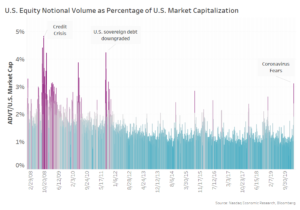
Spreads did spike, but markets didn’t falter
One thing many have highlighted is that markets remained orderly and robust. There were no notable outages despite the complexity of the U.S. markets.
By one common measure, trading costs did increase. However that was consistent with what happens in other bouts of volatility. In Chart 3 we see U.S. large cap spreads increased to nearly 8 basis points (bps) last week, which compares to:
- The Feb. 5, 2018 “Volmageddon” selloff where large cap spreads increased by nearly 60% to 7.1 bps. Although we remind you that most of the increase in VIX that day occurred in the 15 minutes after stocks closed and before VIX futures closed. (That’s a data point that supports synchronizing hours of hedging markets, but that’s a topic for another day).
- The December 2018 government shutdown selloff saw spreads increase much less, not even reaching 6% after starting from elevated levels.
As we’ve discussed before, spikes in volatility should cause spreads to widen. It makes financial and economic sense: As a liquidity provider is writing an option to others in the market, and as volatility increased, the price of that option (spread + rebates earned) needs to increase in value too. That’s why volatility is a key input into the Black-Scholes formula.
Interestingly, it seems the VIX (grey area in Chart 3) reacts more to selloffs than spreads (line) do. Based on the data, a doubling of VIX generally leads to around a 50% increase in spreads.
Chart 3: Average U.S. large cap spreads vs. VIX levels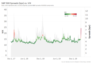
Lit markets shine in times of stress
Data highlights how important lit markets are for price discovery and liquidity during a crisis.
Chart 4 shows turnover (vertical axis) and VIX (horizontal axis). Each day is a circle, with the size of the circle increasing with notional value traded. The color shows the percentage of trading in lit venues (with yellow showing more lit).
The data is startling. It highlights how important lit markets become in a panic. As the demands for liquidity increase, liquidity and price discovery clearly move to lit markets. It could also be interpreted to show how much quotes in dark pools piggy-back off market makers who provide exchange quotes during normal markets.
That’s got important implications for a few areas of contested market structure:
- It highlights the importance that actionable quotes provide to investors needing liquidity. That in turn supports the SECs continued stance against quotes with the ability to fade.
- It also highlights how fair it is that the economic costs of incenting lit prices (and a quality NBBO) should be shared by all venues and participants.
Surprisingly, putting this data in perspective, the biggest day last week, Feb 28th, only ranks 31st for daily turnover between 2008 to now.
Chart 4: As VIX rises, so does turnover and liquidity fails-over to lit venues Primary exchanges and maker taker venues hold up market quality
Looking deeper at where the NBBO comes from is even more interesting.
We know from prior work how important rebates are to reward liquidity providers for their contribution to market quality.
Comparing the contribution to NBBO in normal lit markets to last week is revealing. It shows that primary listing venues had the most robust market quality as stresses increased. That’s not totally surprising given their market maker programs and focus on market quality for issuers in addition to traders. But it does raise the question of whether it’s economically optimal to share SIP revenues equally between exchanges focused on listing versus those only on competing for trading revenues.
Chart 5: Primary markets saw much stronger market quality as market stress increased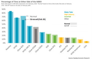
What’s important in times of stress?
It’s pretty clear, liquidity and tight spreads are especially important for investors in times of stress.
Today’s data show that although last week was an unusually large stress on equity markets, the markets performed well, market makers kept spreads tight and helped deliver record notional trading despite an explosion of message traffic and liquidity demand. However, the data also show that last week wasn’t a record on many other levels.
There are important policy implications from this data too. The continued unbundling and fragmentation of trading for competitions sake doesn’t help market quality in a crisis. And the data from dark markets highlights how some venues benefit economically from the NBBO in normal markets, without contributing to the true costs of creating the tight spreads that their customers benefit from.
Let’s continue to debate how to make markets more efficient. But let’s remember all the positive externalities and full economic contribution that all participants bring to the market.
It’s important if we really want to do no harm.